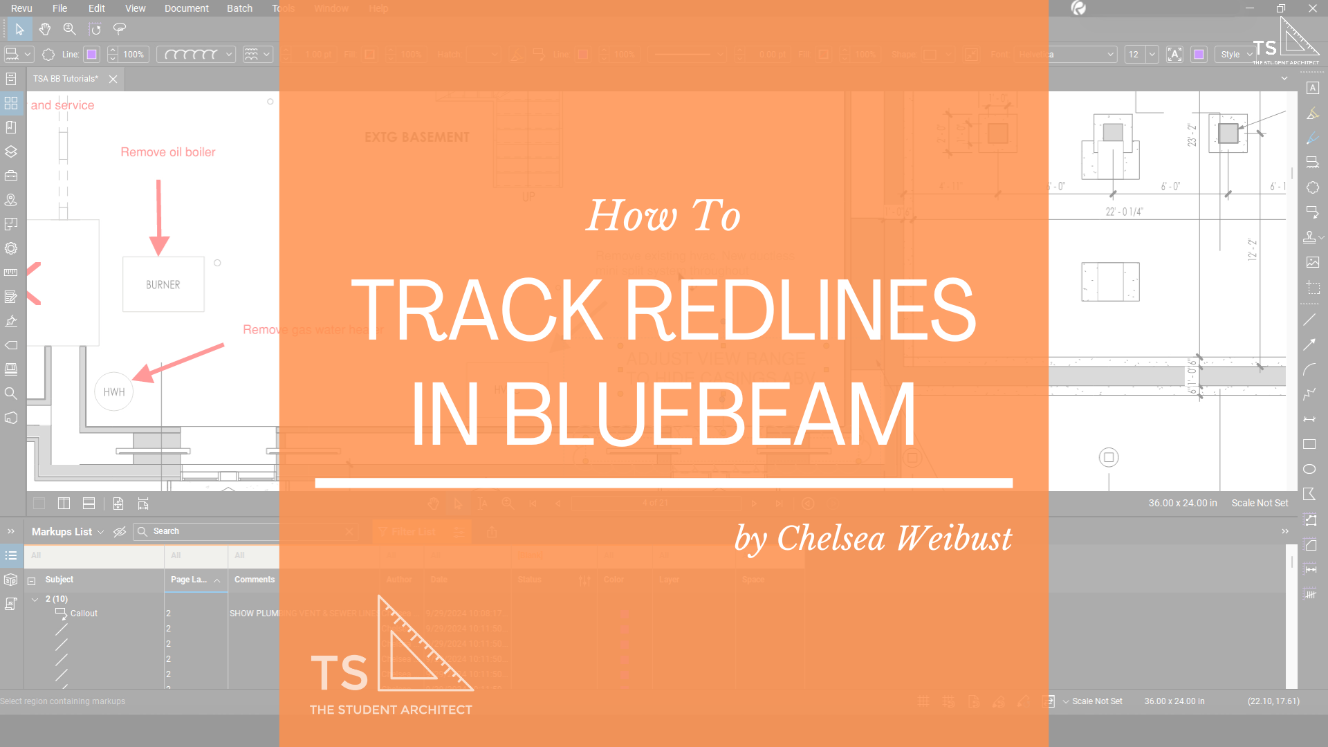
Here I'll show you a better way to keep track of redlines in Bluebeam.
Haven’t purchased yet? Use my affiliate link toand we'll both get $50!
Video Transcript
What's up, friends!
Chelsea here from TheStudentArchitect.com, where you can find tons of resources for Architects and architecture students. Before we begin, make sure that you LIKE and SUBSCRIBE so you can get more Quick Tips like this! And now, let's get into it!
All right, now the old-fashioned way of keeping track of redlines, of course, is to highlight. So we could always go over to the highlighter tool or hit 'H' on the keyboard for the keyboard shortcut, and we could go through, and yep, we could highlight this redline. And then we're like, oh, you know what, let's highlight this too, oh you know, let's make this a little bit more clear that we've definitely picked this whole thing up. And now we have identified that we've picked up this redline. That took a lot of time though, so what's a better way that we could do this? Let me show you. So let's 'CTRL+Z' to undo, and now I'm going to show you a different way that we could do this.
So I'm going to click on this redline here, or this note, and I'm just going to RIGHT CLICK on my mouse, go to Set Status, Review, and here you have a bunch of different options. So this is really great to keep track of what actually happened with this redline. So you might come across a time where a redline doesn't make sense anymore, so it might be rejected or cancelled. Or you might identify it as completed if it's something that you've actually picked up. So this is actually a really cool way to keep track of what's actually happening with your redlines. Because in the old days, at least, what we used to do was just highlight it anyway, and it was understood that it was addressed regardless of what happened. So again, this is just a cool way to keep track of actually what did happen.
So in this case, I'm going to say it's been picked up. So I'll say Completed. And nothing really changed here, and that's because we haven't set up the whole process yet. So what we're going to do is show the Markup List, so we're just going to CLICK AND DRAG here, or we could always DOUBLE CLICK. So we'll go to this redline here, and you can see that the status is set to Completed by me. Now what we can do is we can filter our markups. So I'm going to hit Filter List and I'm going to, over Status, where it says All, I'm going to set that to Blank. So, anything that doesn't have a status assigned to it will be considered blank. So, anything that is considered blank will appear to be in color, the way that the redlines are shown right now. So, if I hit Blank, you're going to see that that redline just disappeared from this list and is now shown in grey.
So basically, the way that we're using this filter is to keep track of redlines that have been picked up versus redlines that haven't been picked up. Anything that's marked as Blank is going to be something that doesn't have a status assigned to it, and anything that does have a status assigned to it will not be Blank. So, I hope that that makes sense. So, anything that has a status assigned to it will be greyed out and will be removed from the Markup List when you have it set to this specific filter. And I didn't have to individually select all of these different elements and set them to a status because they're all connected.
So, we just set a filter for a markup that was created in Bluebeam. Now all of the markups that are in red were done in a separate PDF viewing program such as maybe Adobe, I'm actually not sure. But the cool thing is, is that they're still selectable, they're editable, and you can also set a status to them as well. So we can do the same thing here, although I will note that, because these markups weren't created in Bluebeam, this arrow is separate from this note here. So again, that's just another great thing about Bluebeam is that, if you do it the right way, everything is connected, so you only have to do everything once.
But a little workaround for this is to just do a cross selection and because I'm in the Pan option or the Pan tool here, if I try to CLICK AND DRAG it's just going to Pan around the screen. So, in that case, I would want to use my RIGHT CLICK to CLICK AND DRAG and drop, and then those notes are selected. However, if I was in the Select tool, then I would just be able to use my LEFT CLICK to CLICK AND DRAG and select them that way.
So now that we have these notes selected, I'm going to do the same thing. Just RIGHT CLICK, go down to Set Status, Review, and this time let's do something a little different. Last time we marked it as Completed, maybe this time we'll mark it as Rejected. So, let's turn that filter back on again. We'll click Filter, and it's already set to show Blank. And now that we have that filter on, even though these have two different statuses to them, this status is Completed, this status is Rejected, they're still going to show up as greyed out because they have a status assigned to them. Our filter is set to Blank so anything that doesn't have a status assigned to it is going to be considered blank (or not picked up) and so that's why it will show up in red while these, even though they have different statuses, will show up in grey.
And when I Zoom Out a little bit, you can see it just makes it a lot easier to recognize which notes need to be picked up and which notes don't. And also having them filtered out of this list here makes it a lot easier to just kind of go through the list and just click on a note and it'll bring you right to it. So that can be really useful if you have something like really small lines that might be easy to miss on a drawing. You can just go right to the list, click on that note, and you can even set a status from here as well. So if I RIGHT CLICK here, again Set Status, Review, and let's set this as Accepted. And you can see this arrow now is again it's greyed out. It has a different status but that is okay because since it's still set to a status, it will be filtered out. Again, if I want to turn that filter off, all I need to do is select Filter, and everything will appear the exact same way.
Another thing you can do is, if you change your mind about a status for something, so maybe this was originally Rejected, we could change that status here in the Markup List, or we could do that here on the drawing. Again just RIGHT CLICK, go to Status Review and we can mark that as Completed. And what's going to happen is, it's not going to take away the original status that we set to the drawing, it's just going to add a new status and so you can see that in the status bar. And if I were to shift this column over, you would be able to see the date and the time that each of these statuses were assigned, which is again a very useful feature.
Another thing that you can do is filter by status. So instead of Blank, you can see everything that is marked as Completed, again you could see everything that is marked as Rejected, which could be helpful in case you need to double check anything that was originally marked as Rejected, just to make sure. Or you could set it to a couple of different statuses at the same time. So you can see they're both selected, and those are the, let's unselect Blank here, and it will just filter down to just those two statuses.
Now there's a ton of different ways that you can use these filters and you can use these tools to your advantage when you're working, but this is one of the best ones that I found to keep track of redlines while you're working in Bluebeam.
All right, friends, thank you so much for watching; I hope that you enjoyed this video! If you did, please hit that THUMBS UP and if you haven't subscribed yet, go ahead and SUBSCRIBE! It really helps out my channel, and it lets YouTube know that you like videos like this, and they'll show you more of them. I hope you have a wonderful day, and I will see you next time!
Happy redlining!
♥ Chelsea


